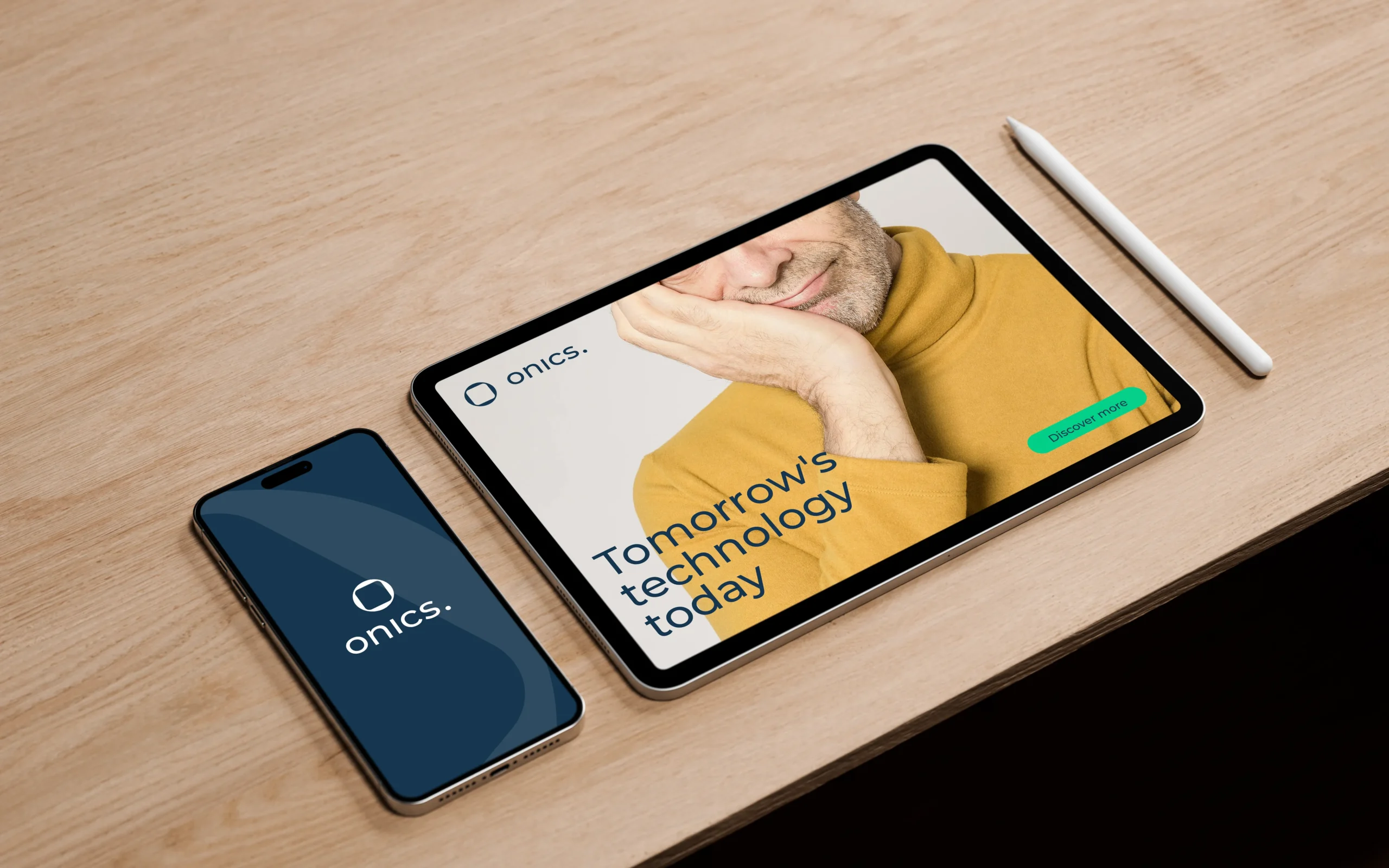

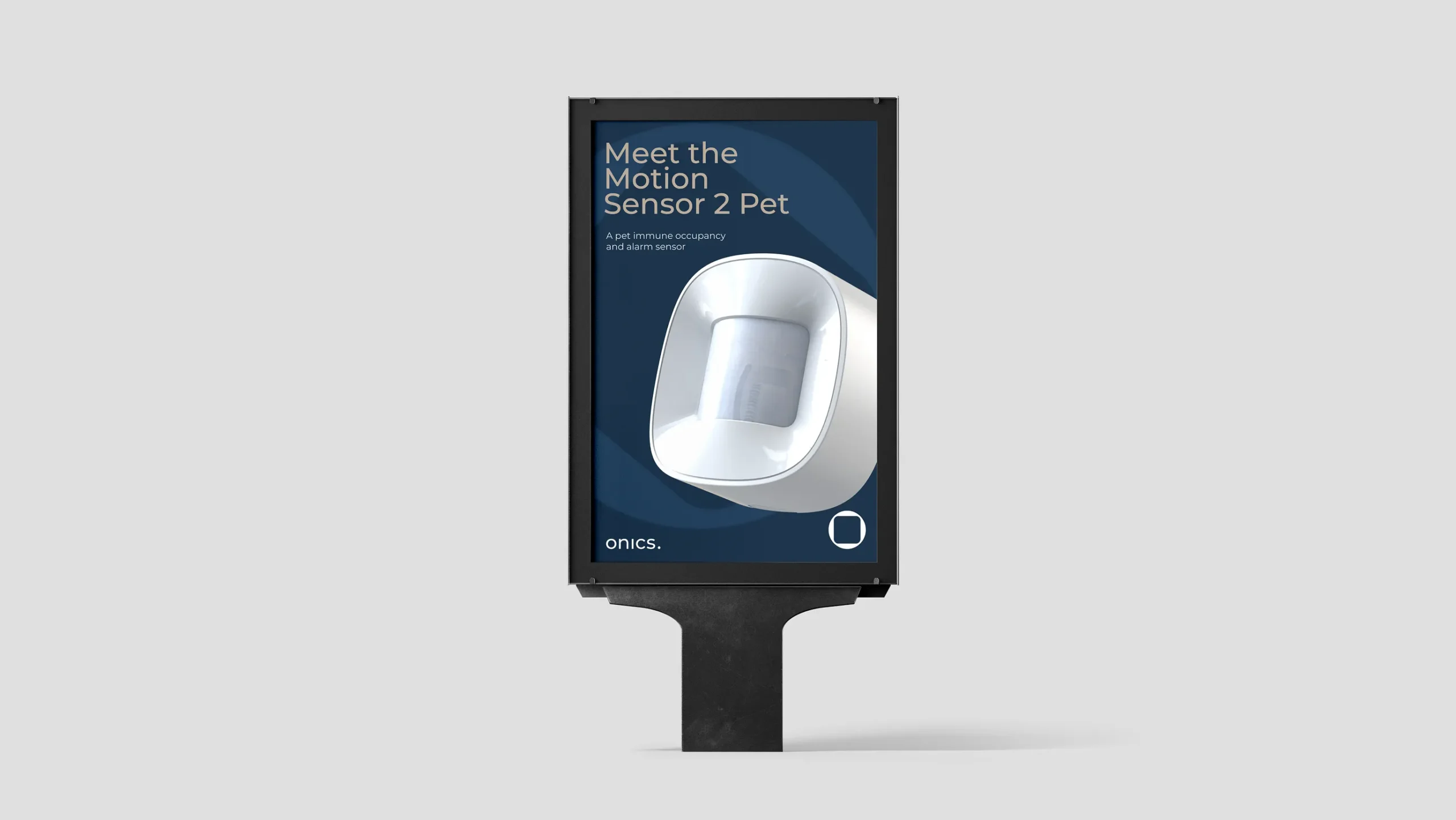
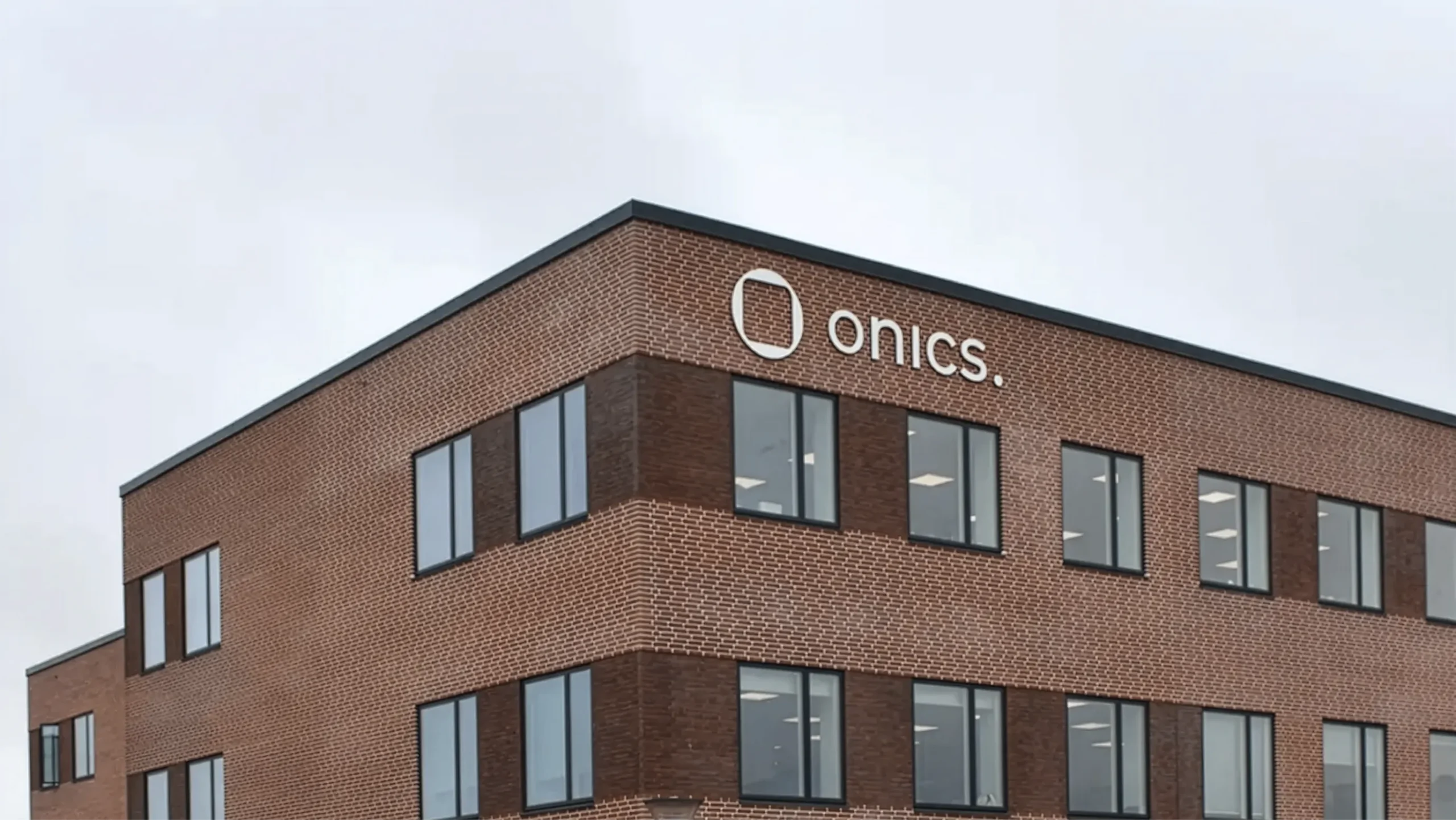
Following the merger of Develco Products and Datek Smart Home, Onics required a new visual brand transformation. The core challenges lied in establishing a cohesive visual identity that balances technical precision with approachable usability. This involved a new logo design and a set of visual brand guidelines.
Our role
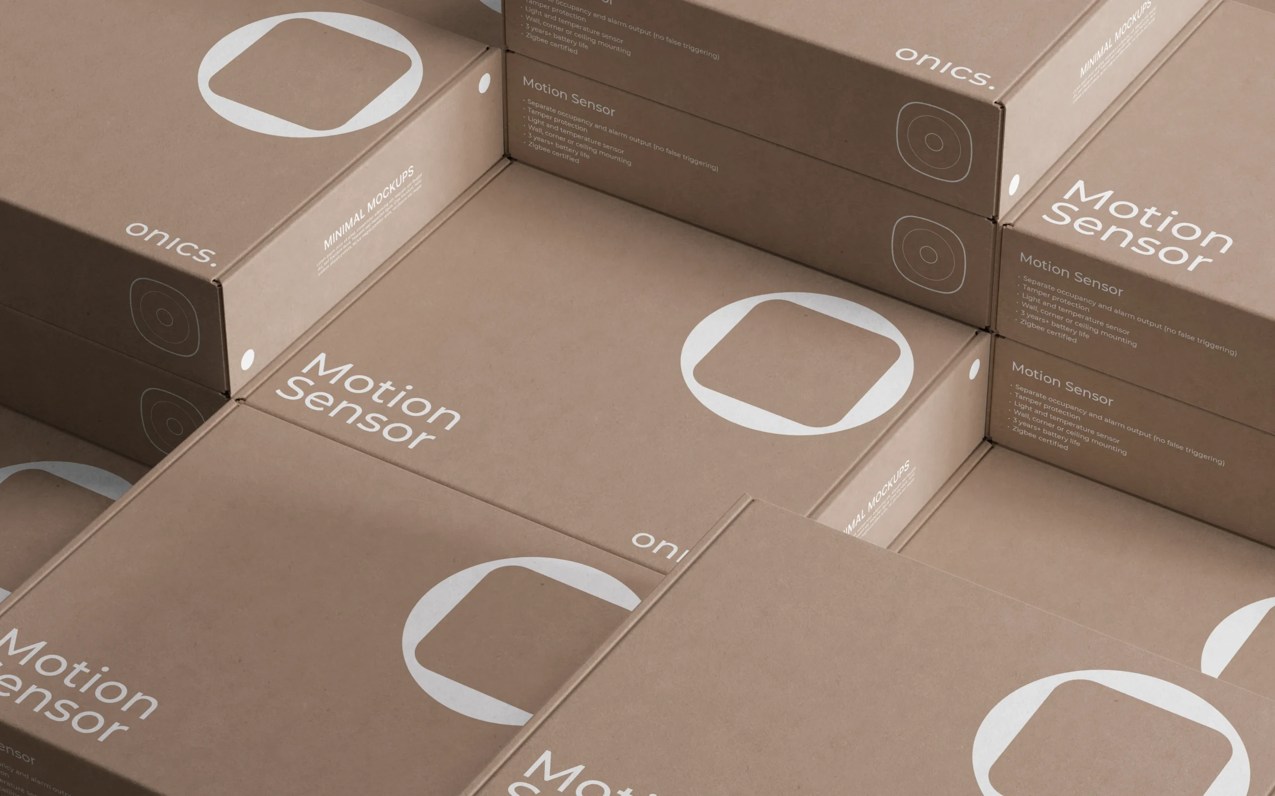
We translated Onics’ core values into a unified, standardized visual brand guide. The focus was to create a flexible, easy-to-use design system to ensure consistency across all future assets.
Process
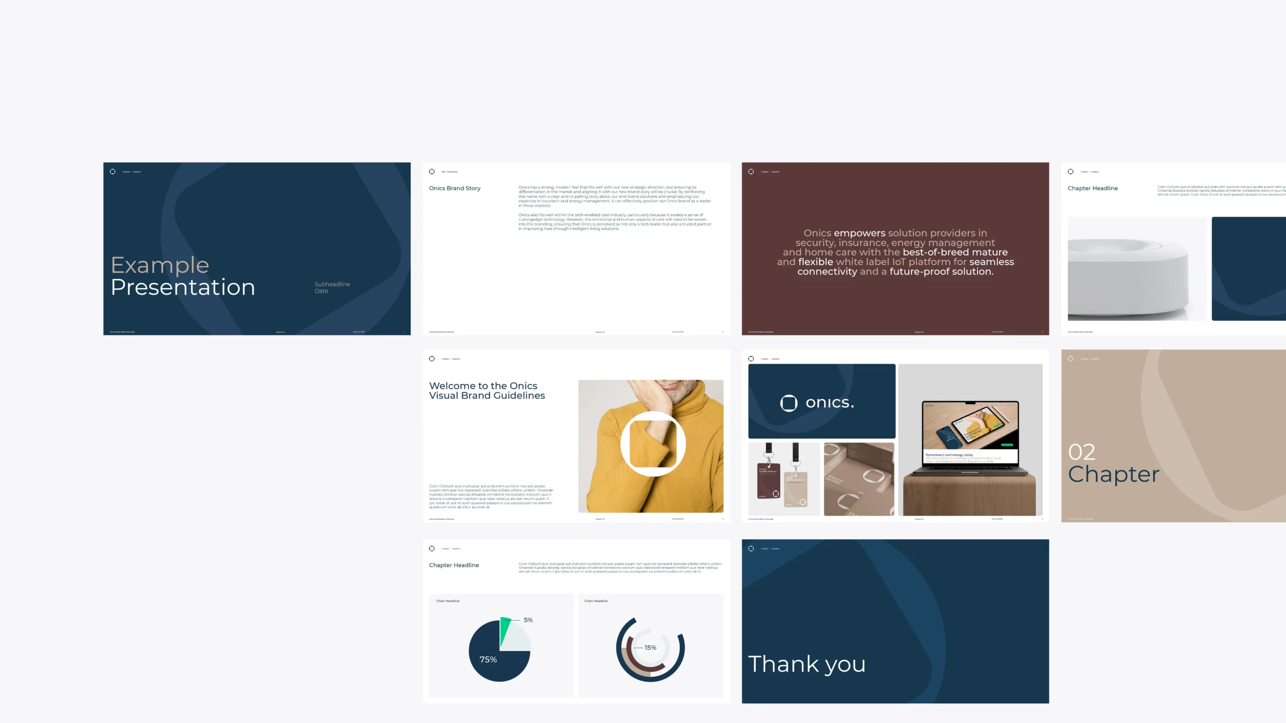
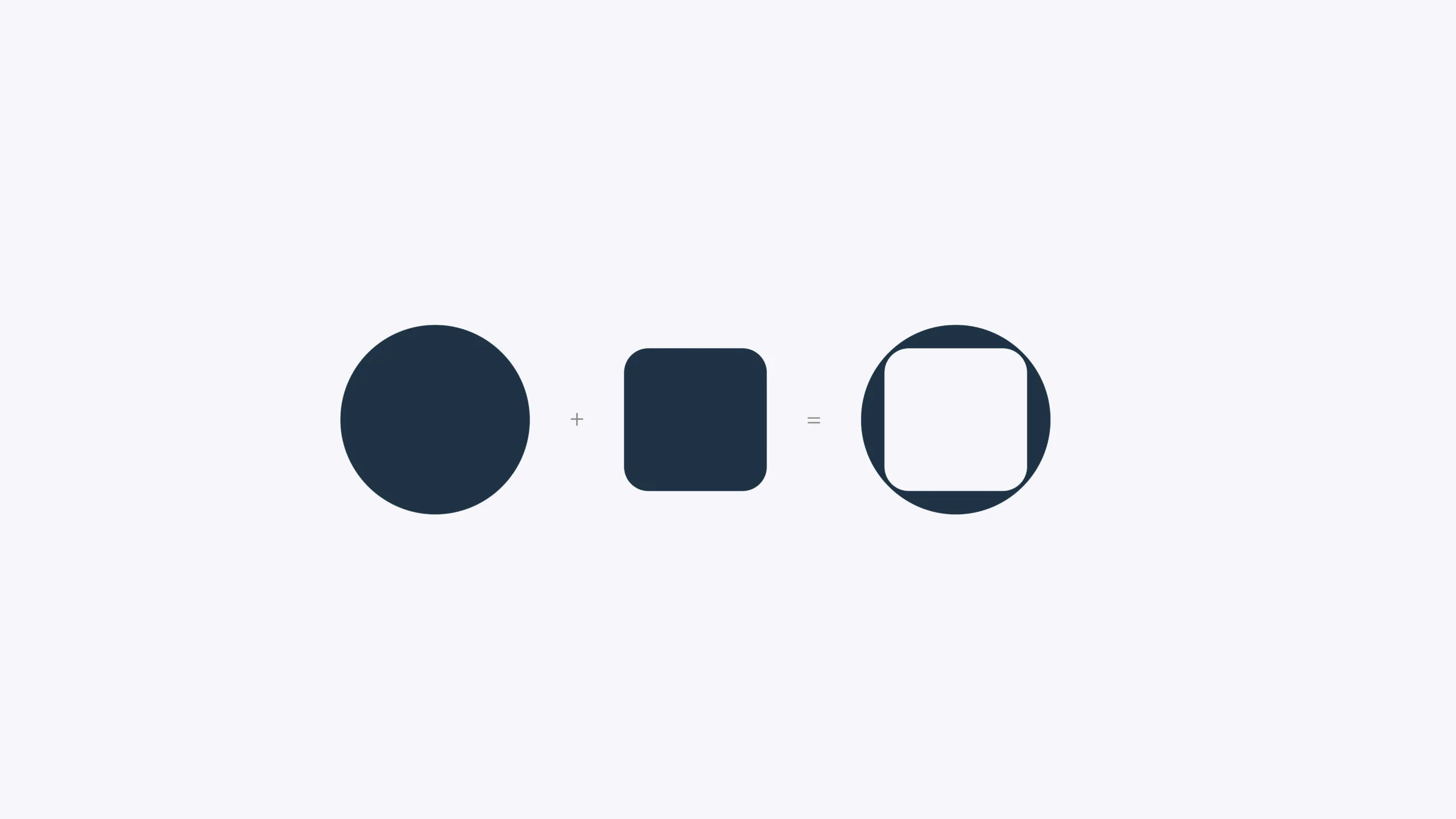
We began by exploring two distinct visual directions and sketching out a new logo mark, which conceptually bridges a rigid square (representing hardware) with a fluid circle (representing software and the letter 'O'). Once a direction was selected, we translated Onics’ brand values into comprehensive visual guidelines, defining a versatile typographic system, a balanced color palette, and clean photography standards.

Result
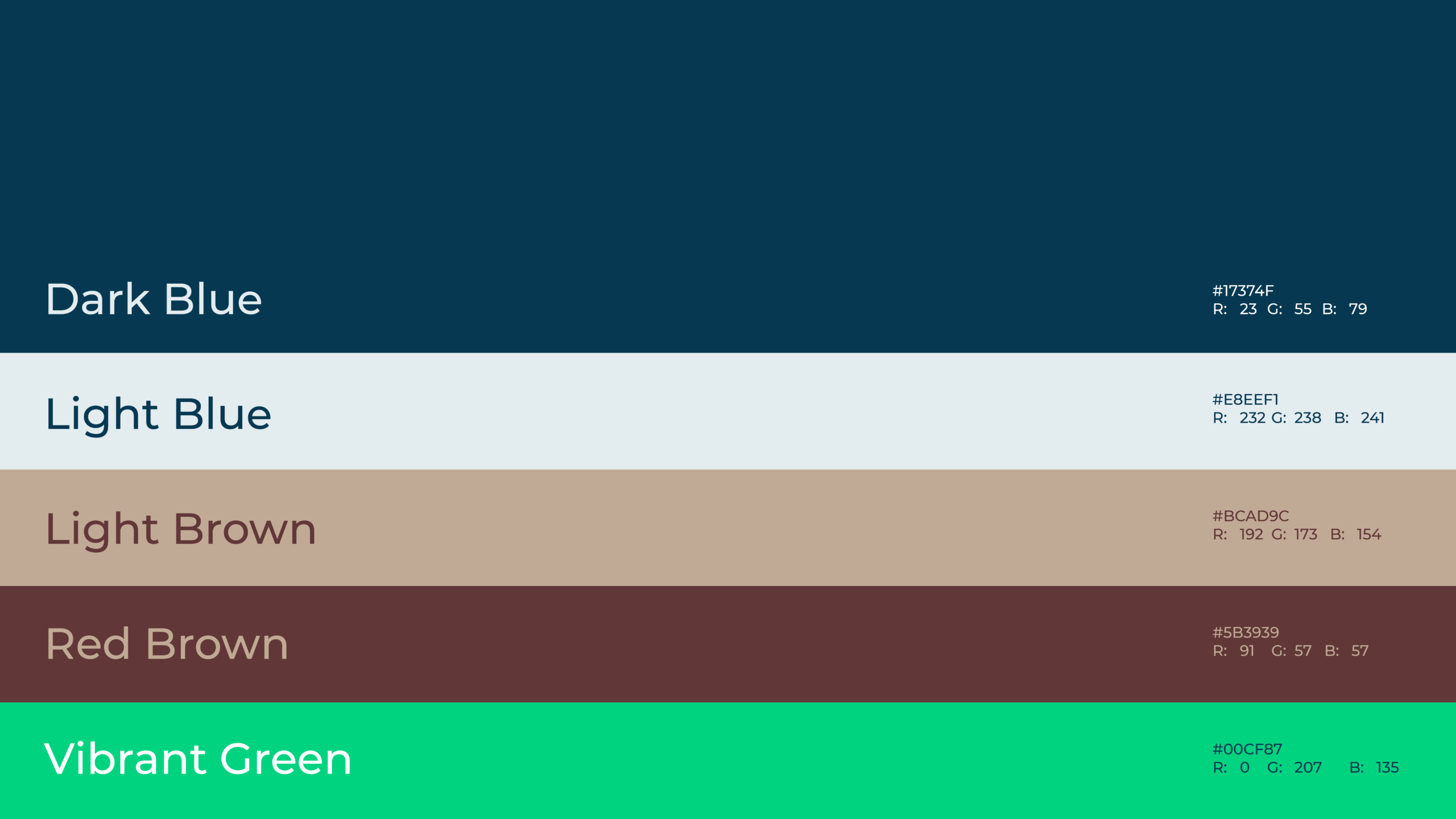
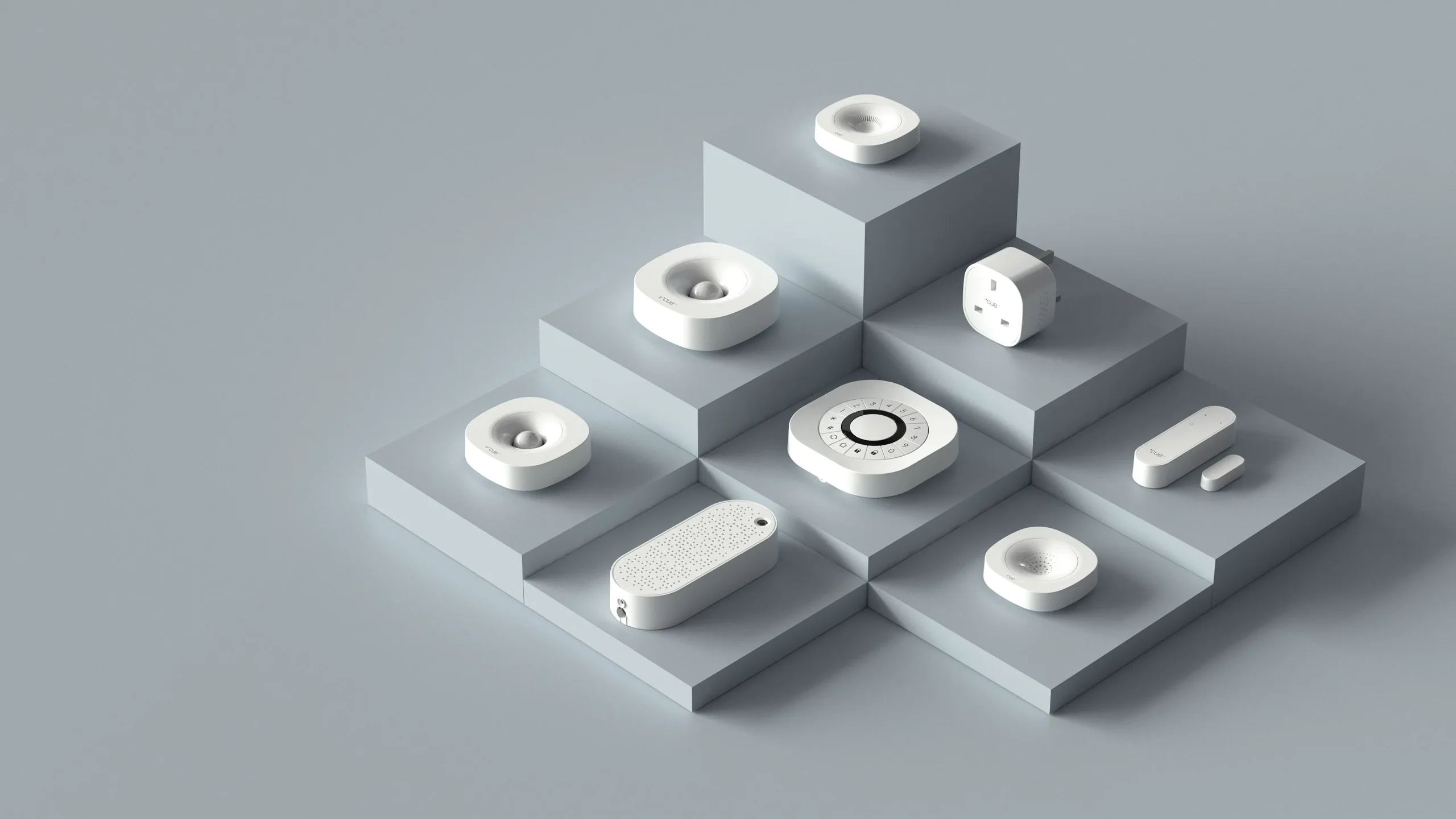
The resulting identity and visual guidelines provide a scalable framework for Onics’ future visual touchpoints. The logo is optimized with versatile vertical and horizontal lockups and strict clearspace rules to protect brand integrity. Typography and color systems are designed for high readability, while product photography and UI layouts maintain a clean, minimal aesthetic with ample breathing room. Finally, the "Mega Logo Mark" was established as a bold, recognizable graphic asset to anchor the platform's overarching identity.
Client
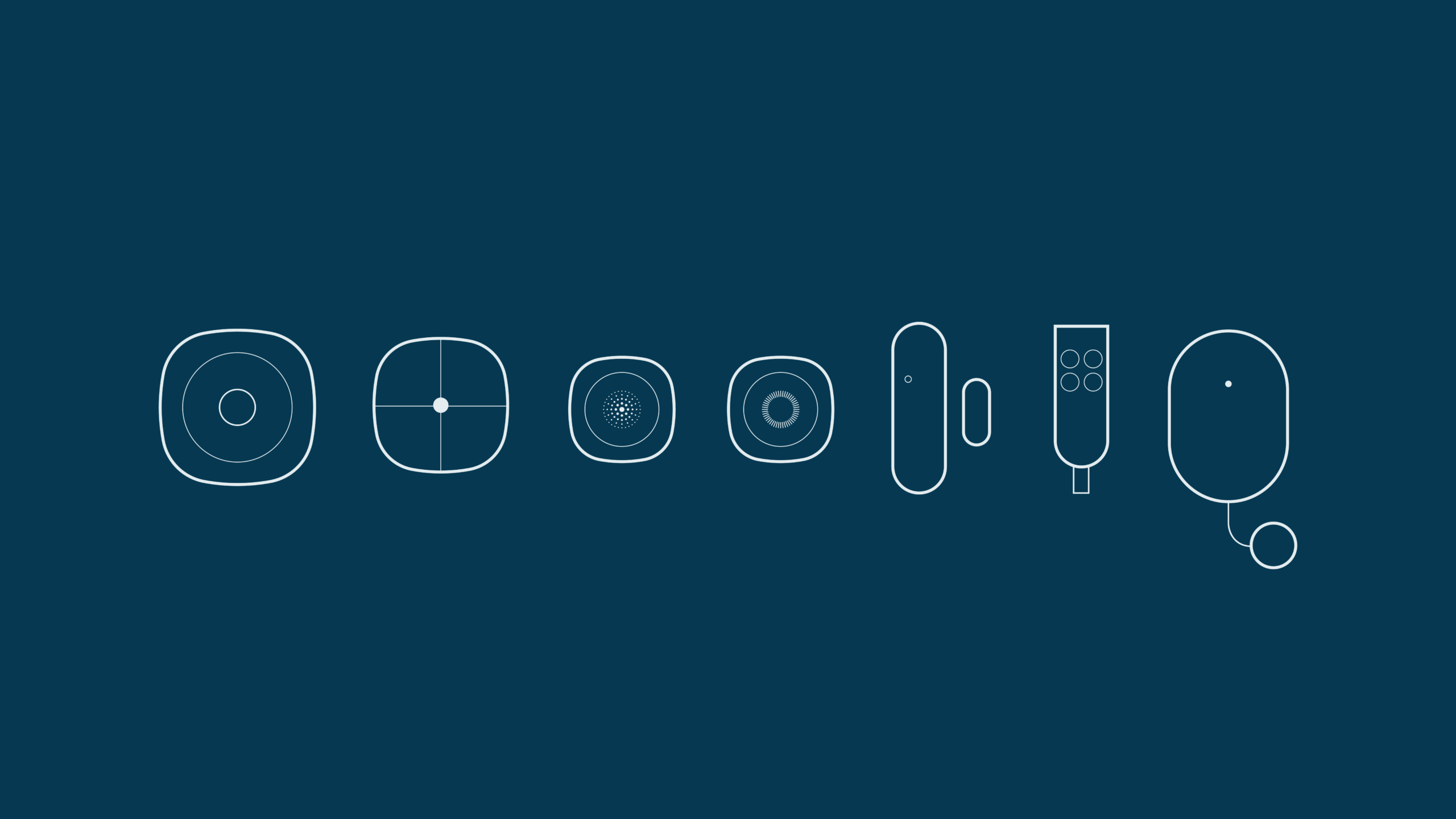
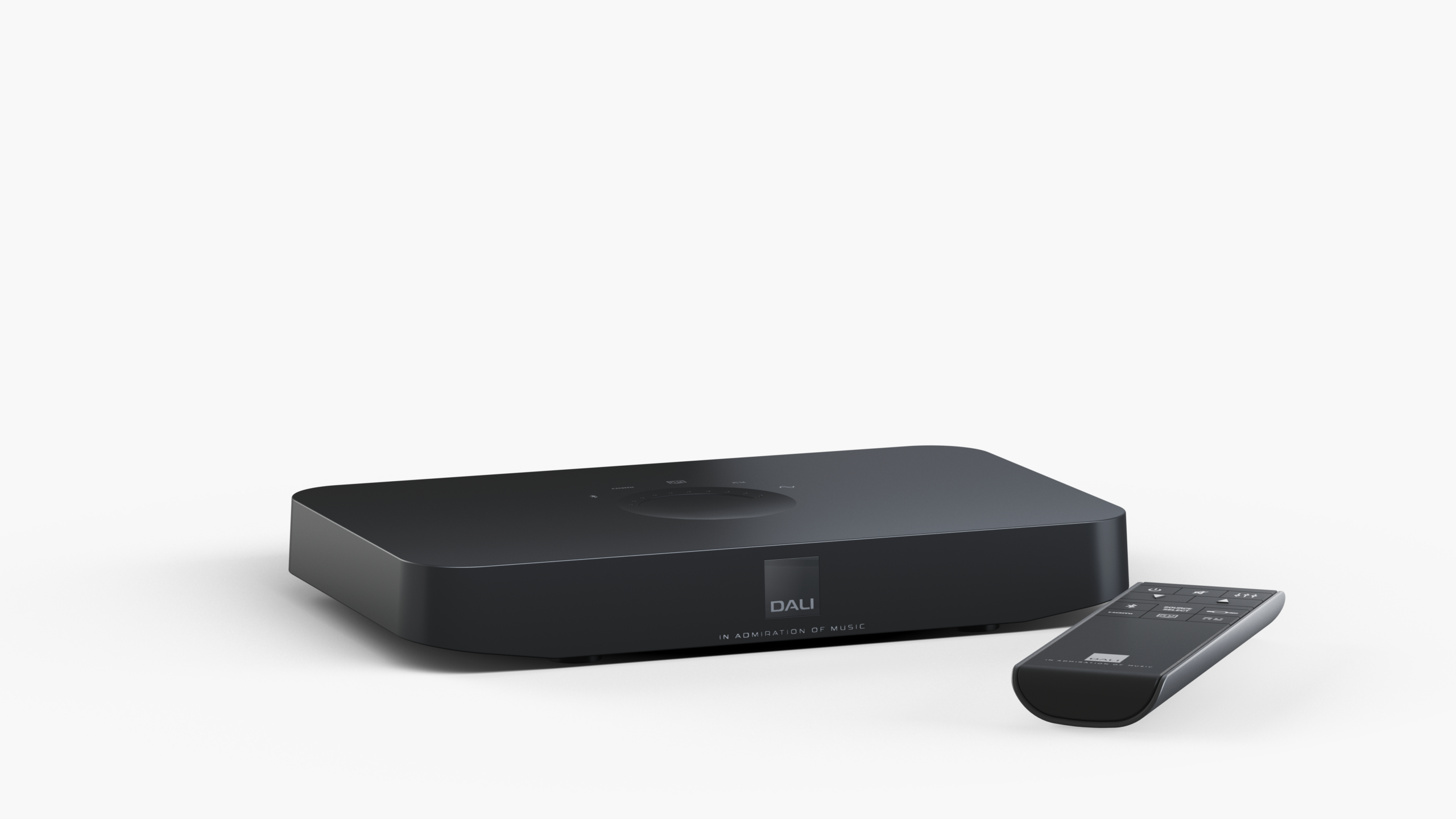
Onics delivers comprehensive B2B IoT solutions, providing the hardware, software, and cloud platforms that power smart home, energy management, and healthcare technologies. They specialize in white-label devices -including gateways, sensors, and smart plugs - allowing businesses to seamlessly brand and deploy their own connected solutions.